Tines Workbench is here!

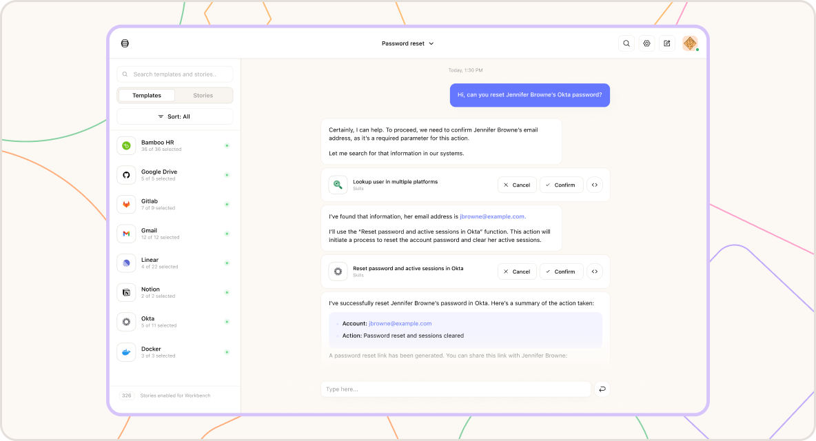
You may have noticed the buzz, but we just can’t stop talking about our latest product, Workbench!
Workbench is a familiar way to interact with your data and take action in real-time when and how you direct it. Be sure to check out our available resources and try it out for yourself!
YDWWT: we have our winners

This year’s entries for You Did WHAT With Tines?! were an impressive bunch, and choosing the winners was not an easy task for our judges.
Michael at Roblox took the top spot, winning with his story Analyze SMS phishing with the AI action. It was a strong example of promoting a culture of cybersecurity for employees and using an effective AI prompt.
A busy month for Cases

Our team was hard at work in September with Cases.
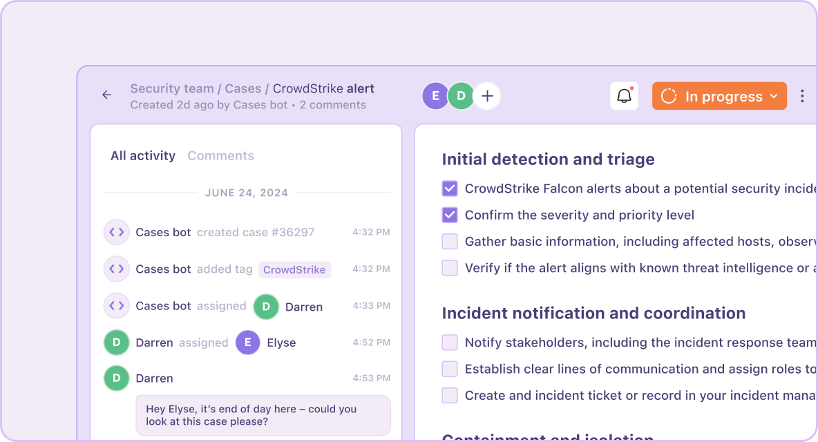
When you’re looking into a case, focusing on what matters most is crucial. That’s why we added the ability to toggle over the cases sidebars and filter the activities in a case timeline to view case information in a more concentrated manner.
But that wasn’t all. You can also:
Link cases to a record directly through the Records API and the Record action
Upload multiple files at once into a case
Assign response time SLAs to cases based on priority level
Visualize your dashboards in a new way

Further customize the way you view and present dashboards in a way that works for your organization thanks to these new updates:
Easily set up Cases and Records charts in the dashboard with our new chart configuration modal
Style your dashboard charts in a way that represents your brand or is specified by topic with the chart color palette
Building with actions

Actions are the building blocks of all stories in Tines.
Through our updates this month, we kept in mind how important each component of an action is, from searching the optional fields of actions and integrations to a simplified icon design.
And now, it’s possible to create no-match links through the the Actions API’s ‘update’ and ‘create’ endpoints.
Navigating around Tines

You may have noticed some visual changes to the layout and navigation of the platform.
We updated the list views across Stories, Records, Dashboards and Cases for a more user-friendly table view.
And we changed up the hierarchy of the navigation dropdown. View your current team and team-scoped entries at the top, while the modified layout helps distinguish between team-scoped and tenant-scoped items