Update January 2025: Download logos and other assets on the Tines brand site.
We just launched our new website. Yes – this one!
There’s a paradox at the heart of Tines: we’ve built the world’s most powerful security automation platform, but it’s also the first that’s friendly enough for the whole team to enjoy using. We wanted a brand and a site that reflected both aspects.
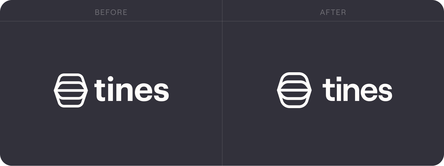
A friendlier logo
It all started with a gentle tweak of our logo. We softened the edges, and introduced a warm new typeface (Roobert by Displaay). Overall this felt a little less severe and more approachable.

Plain language (and space escalators)
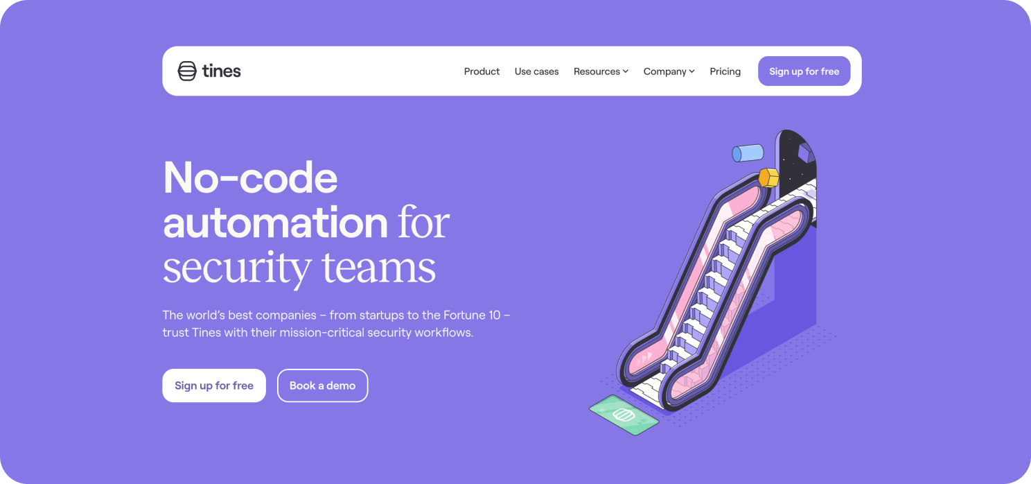
Here on the site itself, we aim to be clear and plainspoken when it comes to explaining Tines. Hence our to-the-point headline, No-code automation for security teams, and how we share that our customers automate an average of 20 workflows in their first year.
But there’s more to Tines than these descriptive facts. It’s ambitious software, built with love, which is surprisingly fun to use. So we developed an abstract illustration style that we hope conveys some of those aspects – like with this escalator to the stars on the homepage.

Our homepage
Use cases
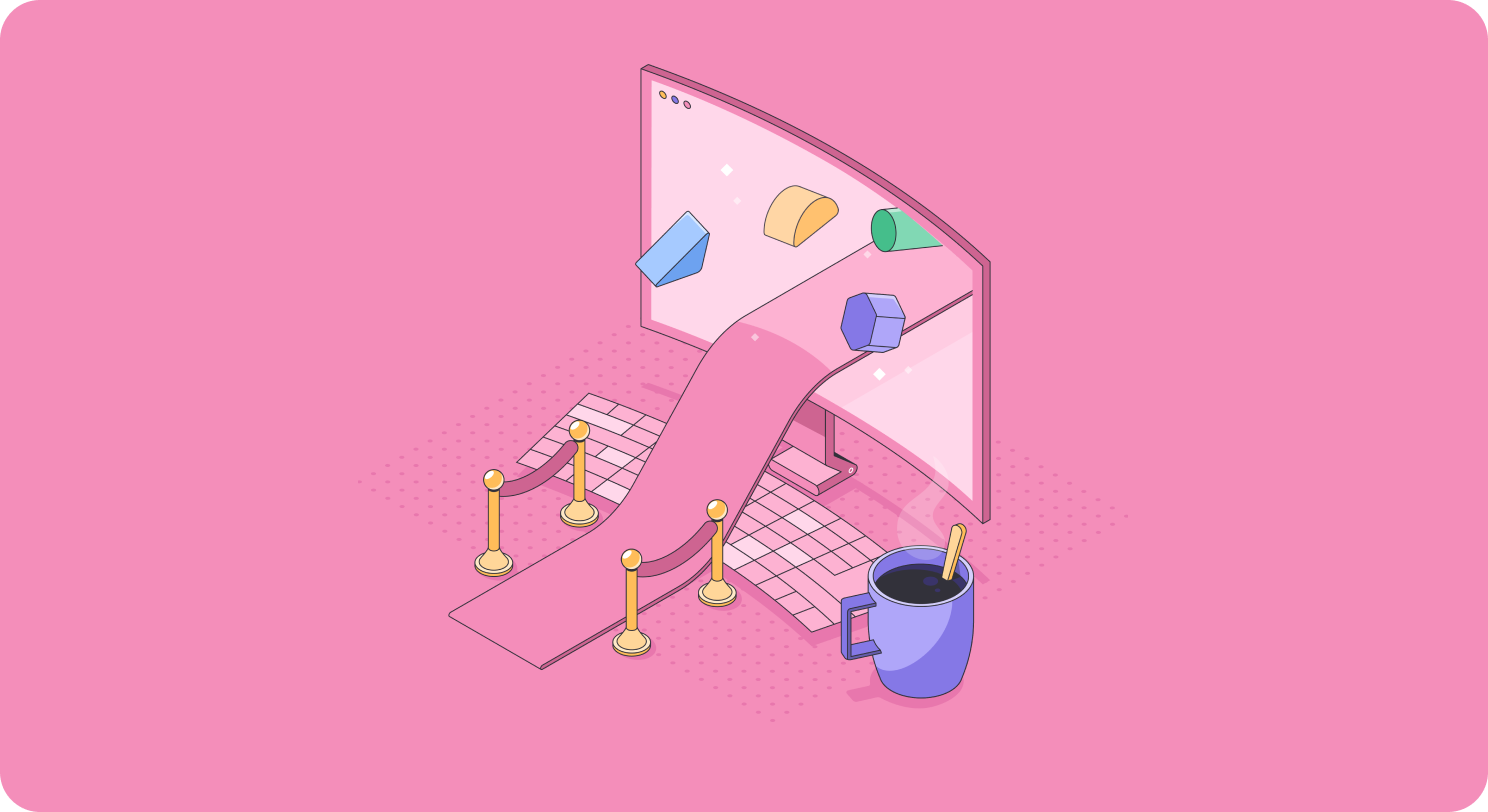
Ultimately, Tines exists to help our customers solve problems through automated workflows. We picked nine of the most crucial use cases our customers depend on Tines for, with a page describing each one. We also added bespoke illustrations including this red carpet representing what great employee onboarding can feel like.

Productive on day one ✨
Brand ≠ visuals
Above all else, our brand is defined by the experience our customers have with our product, and the value it provides them. It's also defined by what it’s like to work here as an employee, or to partner with us. Perfecting those areas is where we spend almost all of our time as a company.
So we know that visual details like these are just the cherry on top. But we're glad to say that – if nothing else – where we’ve ended up feels like a match for our product and our company culture.
⁂
Our thanks to: Dokument (design), Patswerk (scene illustration), and Jaroslaw Danilenko (spot illustration).